
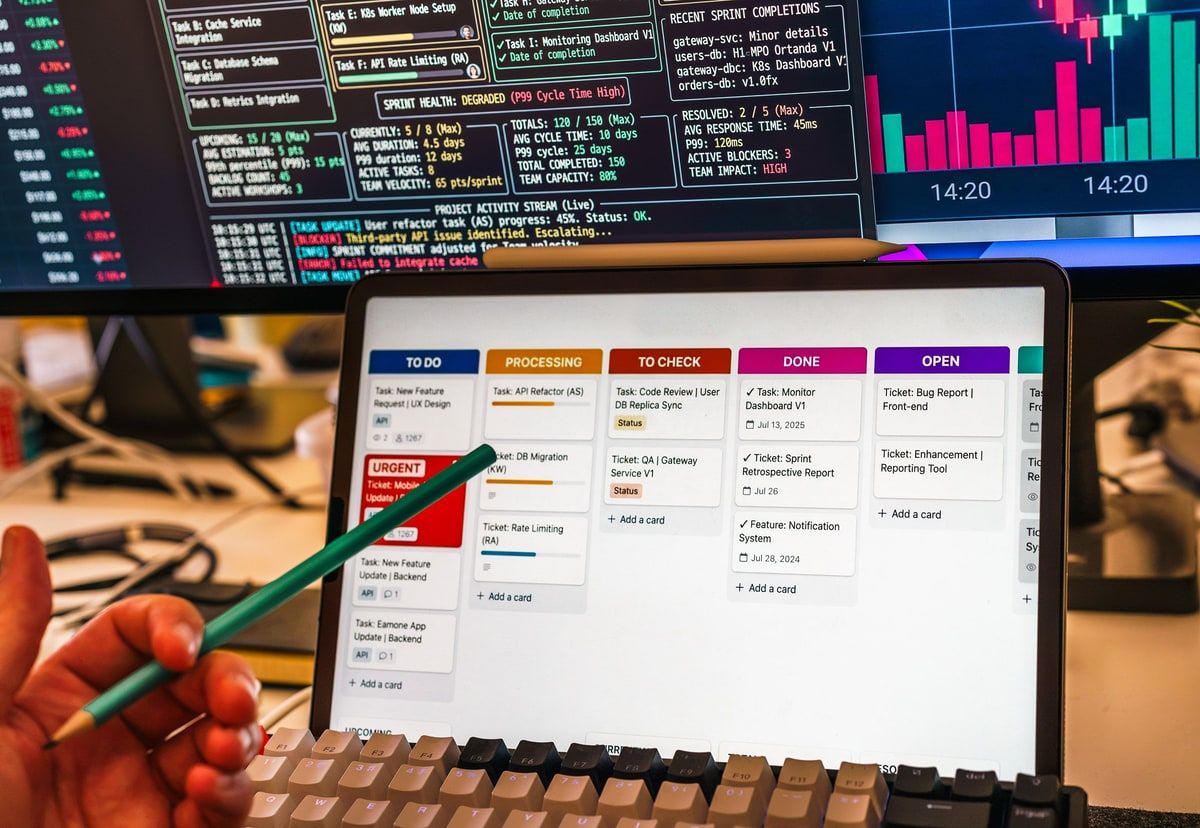
A real-time dashboard is not valuable because every chart refreshes instantly. It is valuable when fresh, trusted information helps the right person notice an exception and take the next action. That requires clear metric definitions, known data latency, sensible permissions, reliable delivery and a design that makes problems easier to act on.
01
The dashboard refreshed every second, but the answer was still an hour old
Imagine an operations manager watching a dashboard that shows unassigned cases, overdue evidence, failed integrations and the workload across four teams. The numbers move throughout the day and a small green marker says the screen is live.
At 11.15, the unassigned case count suddenly looks healthy. The manager moves two people onto other work. Half an hour later, staff discover that an import from the case system has been failing since 10.02. The browser was refreshing every second, but it was repeatedly displaying the same old source data.
Nothing on the screen was technically false. The interface really had fetched the latest number held by the dashboard service. It simply did not explain that the service was an hour behind the operation it was supposed to represent.
This is the uncomfortable truth behind many real-time dashboard projects. Fast visual updates can create more confidence than the underlying data deserves. A useful dashboard must answer two questions together: what is happening, and how recently do we know that to be true?
Real-time dashboard development therefore begins with decisions, ownership and data provenance. The charts come later.
02
Real-time has more than one clock
People often describe a dashboard as real-time when the browser updates without a manual refresh. That only describes the last part of the journey.
A business event first happens in a source system. It may then wait for an export, webhook, queue or scheduled import. The receiving application validates and stores it, calculations turn it into a metric, an API or event transports the result and the browser finally paints a new number.
Each stage adds delay. A WebSocket can deliver the final update in milliseconds, but it cannot recover the fifty minutes lost while a source spreadsheet waits for its hourly import.
The dashboard should therefore record freshness at the source, not only the time the page last contacted its own server. A clear message such as Data complete to 10.02 is more useful than a cheerful green dot that only means the connection is open.
Different figures may also have different clocks. Case ownership could update immediately, finance totals every fifteen minutes and a supplier feed once each night. Honest interfaces show that difference instead of pretending that every tile shares one level of freshness.
03
Start with the decision and the person who owns it
AWS recommends building operational dashboards around the system and business metrics relevant to the audience. That audience point matters. A wallboard for a service team, a finance dashboard and a director summary may use some of the same data, but they support different decisions.
Before choosing a chart, write down the situation that should cause somebody to act. If failed integrations exceed a threshold, who investigates? If unassigned work becomes older than two hours, who reallocates it? If evidence is missing before a deadline, who contacts the customer?
A metric without an owner is only an observation. A metric without a possible action is usually reporting rather than operational control.
This does not mean every number needs an alarm. It means the team should understand why the number deserves space, how old it may become before it is misleading and where a user goes to investigate the underlying records.
A useful real-time dashboard shortens the path from signal to action. It should not force the user to open three other systems and reconstruct the problem by hand.
04
Operational dashboards and analytical dashboards do different jobs
An operational dashboard helps people run work that is changing now. It may show queues, failures, service levels, capacity, blocked cases and events that require attention. Freshness matters because a stale view can cause delay, duplicated effort or a missed obligation.
An analytical dashboard explains patterns over a longer period. It may compare monthly revenue, retention, processing time or customer segments. That work needs consistent definitions and good historical data more than second by second delivery.
The two can connect. A manager might notice a growing queue in the operational view, then open a trend showing that the delay has increased over six weeks. They should not be forced into one overloaded screen.
| Situation | Useful pattern | Why |
|---|---|---|
| Conflicting case ownership or live collaboration | WebSockets or server events | A stale screen can create duplicate or contradictory work within seconds |
| Operational queue watched throughout the day | Timed polling or event updates | Freshness matters, but the exact method depends on scale and operating risk |
| Background import or report progress | Polling with a clear completion state | The user needs honest progress rather than a permanent connection for its own sake |
| Daily management pack | Scheduled refresh | The decision rhythm is slower and stable calculations matter more than immediacy |
| Monthly trend and commercial review | Warehouse or business intelligence refresh | Consistent historical definitions are more important than a live feed |
Real-time is expensive when used without purpose. Data must be collected, moved, reconciled, delivered, monitored and retained. The faster the promise, the more visible every interruption becomes. Use the slowest update rhythm that still protects the decision.
05
The architecture should make stale data visible
A dashboard normally sits at the end of a chain. Source systems create events and records. An integration layer collects them by webhook, queue, API request or scheduled import. Validation and normalisation turn different formats into a common model. The application stores the result, calculates useful summaries and exposes them to the interface.
That chain needs observable checkpoints. The team should know when each source last supplied data, how many records failed validation, whether a calculation job completed and whether the browser can receive updates.
Monitoring only the web page is not enough. A dashboard can return a perfect 200 response while its data pipeline has been quietly broken all morning.
Store the source event time separately from the time it was received and processed. Those timestamps make it possible to distinguish a slow supplier, a delayed queue and a calculation problem. They also support a useful freshness message for the user.
When an import fails, keep the last known value only if the interface labels it honestly. In some operations, an explicit unavailable state is safer than an old number that looks current.
06
Polling and WebSockets are delivery choices, not product strategies
Polling asks the server for new information on a schedule. It is easy to understand, works through familiar HTTP infrastructure and can be entirely adequate for a dashboard that needs updates every thirty seconds or several minutes.
A WebSocket keeps a connection open so the server can push an update when something changes. MDN describes the browser lifecycle through open, message, error and close events. That persistent connection suits live collaboration, high-value alerts and changes that should appear immediately.
WebSockets also create operational work. Connections drop, users reconnect, reverse proxies need correct configuration and the application must decide what happens when an event was missed. Secure sites should use wss, and every subscription still needs authorisation.
The browser should begin from a normal, authoritative data response and use live events to apply later changes. If the connection fails, a timed refresh or reconnect should recover the current state. A dashboard should become slightly less immediate during a fault, not confidently wrong.
Choose the simplest method that meets the freshness requirement. A thirty-second poll may be a better business system than a complex streaming platform nobody monitors.
07
Metric definitions matter more than the chart library
A polished dashboard cannot repair a disputed number. If sales counts an opportunity when a form arrives and operations counts it when the customer record is complete, both teams can build accurate charts that disagree.
Define each measure in plain language. Record its source, calculation, exclusions, owner, refresh rhythm and the timestamp that controls it. Decide how corrections and late-arriving records change previous totals.
Shared identifiers are just as important. Customer, case, order and user records often carry different references in CRM, finance and operational systems. If those references cannot be reconciled reliably, drill-down becomes guesswork.
This work feels less exciting than choosing a dashboard framework, but it prevents months of arguments about whose figure is right. The most valuable dashboard documentation is often a small metric dictionary beside the code.
08
Design around exceptions, not a wall of healthy numbers
Operational users rarely need to admire twenty green charts. They need to notice what has changed, understand why it matters and move into the records that require attention.
Use colour sparingly and attach it to agreed meaning. Red should represent a defined threshold or failure, not simply a number lower than yesterday. Trends and comparisons need enough context to stop normal variation looking like an incident.
Good dashboards also design the quiet states. What does the user see while data is loading? What appears when there are no problems? How is a partial source failure shown? Can a user tell the difference between zero failed cases and a failed query that returned no cases?
Alerts should avoid becoming a second noisy inbox. Give them severity, ownership, acknowledgement and a route to resolution. Record who acted and when if the dashboard supports regulated, financial or customer-facing work.
The best operational view often begins with a short exception list and a handful of accountable totals. Drill-down provides the detail only when it is needed.
09
Permissions must survive the move from source systems
Combining data creates new security questions. A manager may be allowed to see totals for a region but not individual salaries. A service partner may see their own cases but not a competitor's performance. A wallboard may be visible to visitors passing through an office.
Apply role-based access on the server, not only by hiding cards in the browser. Filter both the summary and the records behind it. An innocent looking aggregate can still reveal sensitive information when a team is small.
Live delivery needs the same rules. WebSocket channels, event streams and APIs must authorise the current user before sending data. Reusing identifiers from the page without checking ownership is not access control.
Keep an audit trail for important changes such as acknowledgements, overrides and manual corrections. The dashboard should help explain who knew what and when, not become another untraceable layer over the operation.
10
Build one thin, trustworthy slice first
A sensible dashboard project begins with discovery. Choose one operational decision where stale or fragmented information is already causing measurable friction. Map the sources, owners, definitions, latency and failure modes behind it.
Prototype the view with representative data, including awkward cases. Show a delayed source, a missing identifier, an empty queue and a user with restricted access. The useful feedback usually appears in those states rather than in a perfect set of charts.
Then build one complete path from source event to user action. Add monitoring for source freshness, processing failures and delivery. Test volume, reconnection, permission boundaries and the behaviour when an upstream system is unavailable.
Roll the feature out to a small group and measure the operational result. Did response time improve? Did duplicated work fall? Did managers stop assembling the same report by hand? Did users trust the dashboard enough to act without checking the source system?
Only then should the team add more sources and measures. Trust grows from a small number of reliable answers, not from launching fifty tiles at once.
11
Make the dashboard honest before making it live
Return to the operations manager. The improved dashboard now shows both the case count and the source time behind it. When the import stalls, the queue changes to a clearly labelled stale state and the responsible team receives an alert. Nobody reallocates staff on the assumption that an old number is current.
Case ownership updates immediately because conflicting action becomes harmful within seconds. Finance totals refresh every fifteen minutes because that is enough for the decisions they support. Monthly trend reporting remains on a scheduled business intelligence refresh.
The result is not real-time everywhere. It is better than that. Each part is as fresh as the operation needs, every important measure has an owner and the interface makes uncertainty visible.
That is the standard I use when designing dashboards for business software. The job is not to make charts twitch. It is to connect trustworthy information to the person who can do something useful with it.
If your team is still rebuilding operational reports from spreadsheets, checking several systems or acting on dashboards nobody fully trusts, I can help map the decision, connect the data and build the smallest reliable dashboard that improves the work.
Useful questions
Questions to answer before building a real-time dashboard:
- Which decision should each metric help somebody make?
- Who owns the action when a threshold or exception appears?
- How old can the information become before it creates risk or delay?
- Does the displayed freshness time come from the source event or only the latest page refresh?
- Are metric definitions, exclusions and source systems documented?
- Can users move from a summary into the records that explain it?
- Would scheduled refresh or polling meet the need with less complexity than WebSockets?
- How does the interface show a delayed source, failed calculation or disconnected live feed?
- Are totals, records and live subscriptions protected by the same role-based permissions?
- Are source latency, processing failures and public availability monitored separately?
- What measurable operational result will prove the dashboard is useful?